SwiftUI Tabbed Page View
As a small challenge I wanted to build a tabbed PageView for my current pet project.
The basic implementation of SwiftUI’s TabView allows us to set the style to PageTabViewStyle like
1
2
3
4
5
6
7
TabView {
    View1()
    View2()
    View3()
}
.tabViewStyle(PageTabViewStyle()) // iOS 14
.tabViewStyle(.page) // iOS 15
Which will result in something similar to UIKit’s UIPageViewController where there are no tabs at the bottom of the screen but instead there’s the familiar indicator dots and the user has to swipe to transition to the next page.
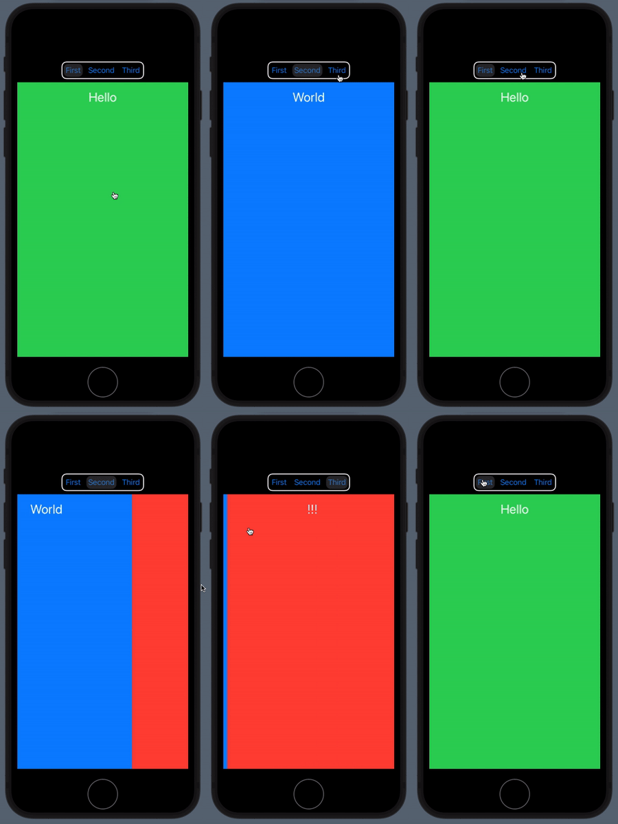
For my use-case I wanted something that still has labelled buttons indicating the currently displayed view and let you navigate directly to the page you want instead of potentially having to swipe through others.
Attempt 1: SwiftUI state and implicit animation
1
2
3
4
5
6
7
8
9
10
11
12
13
14
15
16
17
18
19
20
21
22
23
24
struct SegmentedPageView: View {

    @State var selected: Int = 0

    var body: some View {
        VStack {
            Picker(selection: $selected, label: Text("Views")) {
                Text("View 1").tag(0)
                Text("View 2").tag(1)
                Text("View 3").tag(2)
            }
            .pickerStyle(SegmentedPickerStyle())
            .padding()

            TabView(selection: $selected) {
                View1().tag(0)
                View2().tag(1)
                View3().tag(2)
            }
            .tabViewStyle(PageTabViewStyle(indexDisplayMode: .never))
            .animation(.default)
        }
    }
}
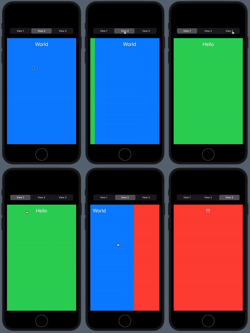
This is fairly straightforward and easy to implement. A segmented Picker serves as the navigation labels and a .animation(.default) modifier applied to the TabView leads to the desired horizontal sliding efffect when transitioning over the pages.
However, the two animation effects (for the Picker and TabView) are not synchronized, which becomes obvious by skipping pages, e.g. when transitioning directly from the first to the third view.
Attempt 2: Matched Geometry Effect
1
2
3
4
5
6
7
8
9
10
11
12
13
14
15
16
17
18
19
20
21
// abridged for readability
@Namespace var namespace
@State private var selection = 0

Button("First") {
    withAnimation {
        selection = 1
    }
}
.overlay(
    VStack {
        if selection == 1 {
            RoundedRectangle(cornerRadius: 10, style: .continuous)
                .fill(Color(.systemFill))
                .matchedGeometryEffect(id: "selectionRect", in: namespace)
        }
    }
)

Button("Second") {
// (...)
Some Polishing to be done
Going further, we can extract the buttons into their own custom View and embed them into a ButtonGroup that hides away the namespace and selection logic and exposes an API that feels similar to TabView’s.
I will tackle this in another post
Remarks
Missing animations
One effect that’s missing so far is that the selection binding value also changes when changing pages via a sliding gesture on the content view itself. In that case the change is not wrapped with withAnimation {} because it’s handled inside TabView.
Glitchy animations
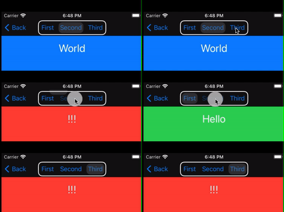
I also found there’s some glitchy behavior when embedding the button stack into .principal position of a toolbar.
1
2
3
4
5
6
7
8
9
10
11
TabView(selection: $selection) {
    View1().tag(0)
    View2().tag(1)
    View3().tag(2)
}.tabViewStyle(PageTabViewStyle(indexDisplayMode: .never))
.navigationBarTitleDisplayMode(.inline)
.toolbar {
    ToolbarItem(placement: .principal) {
        buttonGroup()
    }
}
For the first tap, the selection background actually jumps out of frame as you can see in the video below.
This comes with a console output:
Multiple inserted views in matched geometry group Pair<String, ID>(first: "selectionRect",
second: SwiftUI.Namespace.ID(id: 378)) have `isSource: true`, results are undefined.
Tell me what you think
If you have any questions, remarks or ideas I’d be happy to hear about them.
You can find me on Twitter: @MartinP7r


